简评:TripAdvisor(中文网站为「猫途鹰」)的搜索输入框有文字高亮的效果很有意思,本文将分享如何一步一步建立这种效果。
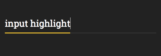
下图即为 TripAdvisor 搜索输入框的「文字输入高亮」效果,这个实现涉及 CSS 和 JavaScript 的知识。

这是已完成的 CodePen:Tripadvisor input highlight
1. 我们首先创建一个简单的 React 组件
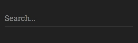
class App extends React.Component { render() { return ( <div className='input-wrapper'> <input placeholder='Search...' spellCheck={false} /> </div> ); }}ReactDOM.render( <App />, document.getElementById('root'));添加 CSS:
$input-font-size: 30px;$input-line-height: 70px;$font-family: Roboto Slab, sans-serif;body { background-color: #222222;}.input-wrapper { width: 500px; margin: 50px auto;}input { height: 60px; width: 100%; min-width: 100%; padding: 0; border-radius: 0; line-height: $input-line-height; background-color: transparent; color: white; font-size: $input-font-size; border: none; outline: none; border-bottom: 3px solid #333333; font-family: $font-family;}添加 HTML 容器:
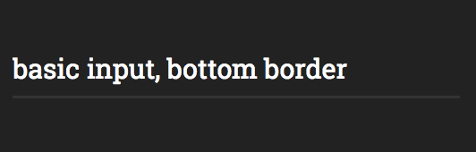
<div id="root"></div>之后我们就得到下图这个基本文字输入界面:

2. 添加边界
这一步实现难点在于宽度需要与文本的末尾保持一致,也需要与任何font-family和font-size保持协同。
由于输入元素width是固定的,我们需要一些其他方法来检测文本的末尾。
我们通过提供一个道具来将输入从非受控状态切换到受控状态value,于是 React 组件现在是这样子的:
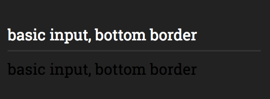
class App extends React.Component { render() { return ( <div className='input-wrapper'> <input placeholder='Search...' spellCheck={false} value='basic input, bottom border' /> <span className='input-highlight'> basic input, bottom border </span> </div> ); }}添加以下 CSS 规则 input-highlight
注意:我们在这里使用 SCSS 变量来确保和font之间的属性相同:inputspan
.input-highlight { font-size: $input-font-size; line-height: $input-line-height; font-family: $font-family; max-width: 100%;}效果是这样:

接下来,添加一个顶部边框span和位置,使其边框叠加输入的底部边框。
.input-highlight { font-size: $input-font-size; line-height: $input-line-height; font-family: $font-family; max-width: 100%; border-top: 3px solid white; position: absolute; left: 0; bottom: 0; height: 0;}.input-wrapper { width: 500px; margin: 50px auto; position: relative;}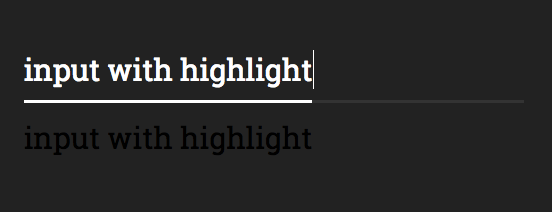

span 元素以文本结尾,这使得它的宽度与输入文本宽度一致。
现在,简单的部分是:每次输入内容发生变化时,我们使用 JavaScript 来更新跨度中的文本。我们将使用 React state来同时更新输入和跨度的值。
这是我们更新的组件:
class App extends React.Component { constructor() { super(); this.state = { inputValue: '' }; this.onInputChange = this.onInputChange.bind(this); }onInputChange(e) { const { value } = e.target; this.setState({ inputValue: value }); }render() { const { inputValue } = this.state; return ( <div className='input-wrapper'> <input onChange={this.onInputChange} placeholder='Search...' value={inputValue} spellCheck={false} /> <span className='input-highlight'> { inputValue.replace(/ /g, "\u00a0") } </span> </div> ); }}.replace(/ /g, "\u00a0") 这部分是 React 正确处理空间所必需的。
然后,通过将以下行添加到input-highlightCSS 选择器来隐藏该跨度:
color: transparent;user-select: none;overflow: hidden;我们需要overflow: hidden跨度来限制其宽度,否则会导致容器水平拉伸

3. 大功告成
最后一步是为高光添加不同的onFocus颜色。
要做到这一点,我们需要一种基于输入的焦点状态来设置范围的方式,我们将使用 CSS 兄弟选择器(+)。
这里是完整input选择器的代码,包括兄弟选择器input-highlight:
input { height: 60px; width: 100%; min-width: 100%; padding: 0; border-radius: 0; line-height: $input-line-height; background-color: transparent; color: white; font-size: $input-font-size; border: none; outline: none; border-bottom: 3px solid #333333; font-family: $font-family; &:focus { + .input-highlight { border-top: 3px solid #fbc91b; } }}大概就这样 ~
原文链接:Text input highlight, TripAdvisor style
推荐阅读:YouTube 上有哪些自学编程的优质频道
极光日报,极光开发者 的 Side Project,欢迎关注。